Digital Monthly Planner for Real-Life Planning
Digital Monthly Planner for Real-Life Planning

Have you ever had a week where everything was technically on the calendar, but you still walked into it completely unprepared?
Not because you forgot anything. Because you couldn't see the shape of it — whether you'd front-loaded three deadlines into Tuesday, whether that trip and that project review were actually the same day. A digital monthly planner is supposed to solve exactly that. Whether it actually does depends a lot on how you're using it.
What a Digital Monthly Planner Is Best For
Big-picture visibility, deadlines, and pacing
A monthly view does one thing well: it shows you the terrain.
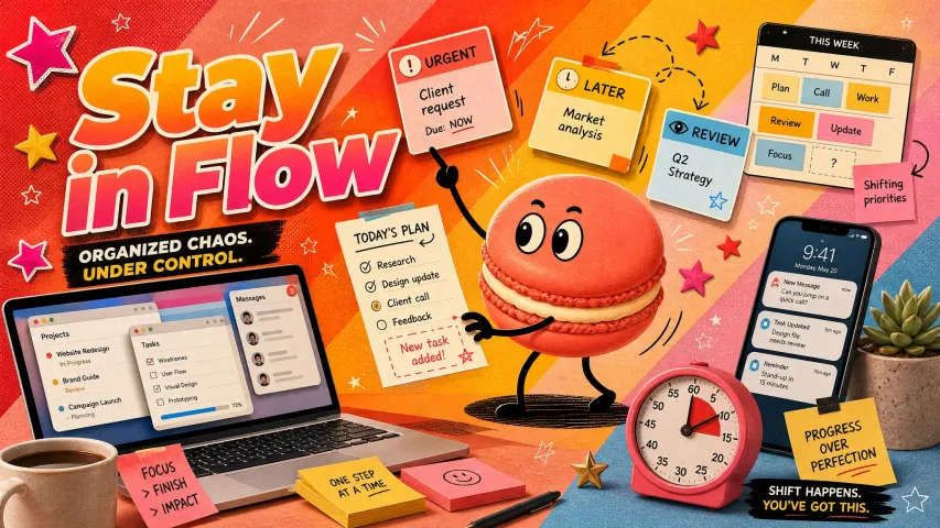
When I started using one consistently, I wasn't trying to replace my weekly planner. I was just tired of being ambushed. A deadline I forgot was coming. A week that looked fine in isolation but was actually packed end-to-end. A social commitment I'd scheduled right before a high-focus work sprint, when I should've known better.
The monthly view surfaces those conflicts early — before they become the kind of week where you can't remember what day it is and you're eating lunch at 4pm.
What it's genuinely good at:
- Deadlines and deliverables: Anything with a hard date belongs here first. Not the task steps. Just the endpoint.
- Recurring commitments: Weekly meetings, standing calls, scheduled rest — things that repeat and shape the rest of your time.
- Pacing: Seeing whether you've got three heavy weeks followed by one light one, or whether you're spread evenly. Both can be right. But you can't pace what you can't see.
- Buffer awareness: Where are the gaps? Because gaps disappear fast if you don't notice them first.
Here's the thing — monthly planning isn't about knowing exactly what you'll do on the 17th. It's about knowing whether the 17th has room.
How to Set Up a Digital Monthly Planner
Anchors, recurring dates, and review windows
I've tried a lot of setups. The ones that stuck weren't the most elaborate — they were the ones I could maintain in ten minutes once a week without resenting them.
A functional digital monthly planner has three layers:

- Anchors These are the non-negotiables. Fixed appointments, travel, events, external deadlines. Add these first, before anything else, because they define the frame everything else fits around. If you add tasks before anchors, you'll inevitably schedule a heavy work sprint over a week you're half-present.
- Recurring dates Weekly rhythms that repeat. If you always do a review on Sundays, block it. If you have a standing call every Tuesday morning, it's there. These aren't reminders — they're structural. They tell you, visually, which slots are already spoken for.
- Review windows This is the part most people skip. At the start of each week, look at the month. Not to plan the week in detail — that's weekly planning. Just to check: does this week fit what I thought it would be? Is anything coming up in two weeks that I need to start thinking about now?
Five minutes. That's the whole review. If you want a concrete structure for what to actually cover in those five minutes, the GTD Weekly Review checklist breaks it down cleanly — even if you're not a GTD person, the calendar-review section translates directly to monthly planning.

On the tool side: any calendar app handles this. Google Calendar, Apple Calendar, Notion calendar view, Fantastical. I've used most of them. The tool matters less than the habit of actually opening it before the week starts.
What Belongs on a Monthly View and What Does Not

Priorities, commitments, and planning overflow
The fastest way to break a monthly planner is to treat it like a task list.
What belongs:
- Deadlines (the end date, not the subtasks)
- Fixed appointments and events
- Travel or time-away blocks
- Major milestones
- Intentional rest or buffer days you want to protect
What doesn't:
- Individual tasks ("write section 2 of report")
- Daily to-dos
- Anything that doesn't have a specific date yet
- Micro-decisions about how to spend an afternoon
When people complain that monthly planning "doesn't work," it's usually because they've loaded it with things that belong in a weekly or daily view. The monthly layer is supposed to stay light. That's what makes it readable.
And the readability is the whole point. If your monthly view is dense with tasks, you lose the thing it was actually giving you — a clean sense of how time is shaped.
Common Mistakes
Overloading the month and ignoring weekly planning
Two patterns I've seen (and done) consistently:
Overloading the monthly view. Adding every task, every small to-do, every "maybe this week" item. The view gets cluttered. You stop opening it because it's overwhelming. Then you're back to being ambushed by the week.
The fix is harsh but simple: if it's a task, it doesn't live on the monthly view. It goes on a weekly or daily layer. The monthly layer only gets dates.
Treating monthly planning as the whole system. David Allen called the weekly review a "critical success factor" in making any planning system stick — and that's exactly why monthly planning alone doesn't work. The monthly layer shows you the shape. The weekly layer is what makes it operational. Without it, you still feel scattered come Monday morning.
If you only use a monthly planner and wonder why you still feel scattered — it's not the monthly view's fault. It was never designed to do all three jobs.
Monthly vs Weekly vs Daily Planning
When each layer matters most
These three aren't alternatives. They're layers, and they answer different questions.
Monthly planning gives you the map. Weekly planning gives you the route. Daily planning gives you the next step.
Most people who feel disorganized are missing one of the middle layers — usually weekly. They have a vague sense of the month (or none), they have a daily to-do list, and they're surprised every Monday when the week doesn't go how they imagined. Research on timeboxing and calendar-based planning backs this up — moving commitments onto a calendar instead of keeping them on a list is what makes weekly planning actually land.
The monthly planner doesn't fix that on its own. But it gives the weekly planning something to work from.
Limits and Trade-Offs
Honest answer: a digital monthly planner won't solve disorganization. It'll show it to you earlier, which is useful, but it's not a system on its own.
It also doesn't capture energy. You can have a light week on paper — few appointments, no hard deadlines — and still burn out because you didn't account for a difficult project that requires four-hour focus blocks. The calendar shape tells you the what and when. It doesn't tell you how much mental effort a task actually requires — and cognitive load research has been pretty consistent on this: working memory has hard limits regardless of how clean your calendar looks.
A few things worth knowing before committing to a setup:
- It only works if you look at it. A monthly planner you open once at the start of the month and never touch again is mostly decoration.
- It requires some discipline about what goes on it. If you break the "dates only" rule, it degrades fast.
- It won't make decisions for you. It shows you the trade-offs. You still have to make them.
That said — for people who feel like time moves too fast and they're always reacting, the monthly view is often the missing piece. Not because it solves the problem, but because it makes the problem visible.
If you're tired of getting to Friday wondering where the week went, that's the thing worth fixing first.
FAQ
What should go in a digital monthly planner?
Fixed dates: deadlines, appointments, events, travel, recurring commitments. Anything with a specific calendar date that shapes how the rest of your time works. Tasks without fixed dates don't belong here — they go to a weekly or daily layer.
Is monthly planning enough by itself?
No. Monthly planning shows you the shape of a period. It doesn't tell you what to do on any given day. You'll still need some form of weekly planning to translate that into a workable week, and daily planning to decide what's actually happening hour to hour. The monthly view is the starting layer, not the whole system.

If you want something that handles the planning side without the overhead of maintaining three separate systems manually, Macaron lets you talk through what your month looks like and generate a tracker or planner layout on the spot — adjusted to how you actually work, not a generic template. Worth trying if building a planning system from scratch sounds exhausting right now.
Recommended Reads
Daily Planner App: What to Look for in 2026


Apply to become Macaron's first friends
Read & discover
Free calculators
Company


