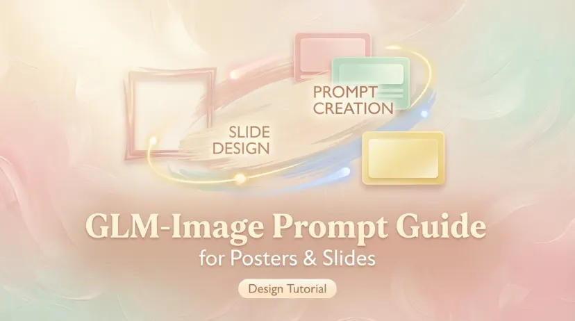
GLM-Image Prompt Guide for Posters & Slides (Chinese/English Text)
GLM-Image Prompt Guide for Posters & Slides (Chinese/English Text)

Hello, my friends. I'm Anna. I wasn't planning to test GLM-Image prompts this week. I just needed a simple event poster, and my brain refused to pick fonts. I opened the model, half-expecting messy letterforms and the usual "Sumer Fesival" typos. That didn't happen, at least not immediately. What surprised me was how much the prompt structure changed the outcome. When I treated it like a layout brief instead of a poetic wish, the text came out cleaner and more intentional. Still imperfect, still a bit stiff on smaller lines, but usable.
I tested these prompts on a handful of posters and PPT covers over two evenings in January 2026. Here's what actually worked, where it stumbled, and copy‑paste prompts you can try without a deep jump into design tools.

Prompt Structure for Text-Heavy Images
I used to write prompts like a mood board. Pretty words, vague outcomes. With GLM-Image, text rendering behaves better when I'm blunt and structured, like a tiny creative brief the model can't ignore.
Here's the framing that consistently gave me the most readable results (and fewer mystery typos):
- Start with the job, the size, and the vibe in one sentence: what this is, who it's for, and the mood.
- Declare the canvas and margins early. If the layout feels boxed in, the text stays legible.
- Provide exact text blocks, line by line, with hierarchy labels. Don't rely on the model to split lines sensibly.
- Give typography guidance as ranges, not absolutes: "bold, geometric sans for title: clean sans for body: high contrast."
- Lock color choices to 2–3 colors max. The model behaves better when it can't wander.
- Place text using zones (top, center, bottom, left column, right column). This helped more than I expected.
- Add a constraint for cleanliness: "no extra logos, no watermarks, no faux effects."
- Ask for spelling accuracy and sharp text. It doesn't guarantee perfection, but it reduces weirdness.
- Finish with aspect ratio, resolution, and a short style note.
A simple scaffold I keep coming back to (fill in the brackets):
"Design a [poster/banner/PPT cover] for [audience] with a [calm/energetic/minimal] mood. Canvas [width × height or aspect ratio]. Use generous margins.

Text content and hierarchy:
TITLE: "[exact title]"
SUBTITLE: "[optional, short]"
DETAILS: "[date/time]" | "[location]" | "[CTA or link]"

Layout:
- Place TITLE at [top/center], large.
- Place DETAILS at [bottom], small, high contrast.

Typography:
- TITLE: [bold geometric sans / elegant serif], strong letterspacing, all caps allowed.
- BODY/DETAILS: [clean sans], readable tracking, avoid decorative fonts.

Color:
- Palette: [2–3 colors], high contrast for text.

Style:
- Minimal, flat, no textures or extra icons. Keep text crisp, spelled correctly.

Output:
- Aspect ratio [e.g., 4:5 poster / 16:9 slide], high resolution, sharp text."
Poster Prompts (Copy-Paste Ready)
These are the exact prompts that produced the cleanest text for me. No code blocks here, just copy from the quotes.
Event Poster
"Design a minimal event poster for curious professionals. Canvas 4:5 with generous margins. Mood: calm, focused, modern.

Text content and hierarchy:
TITLE: "Evening Notes: A Quiet Meetup"
SUBTITLE: "Short talks about small, useful tools"
DETAILS: "Thu, Feb 20, 7:00–8:30 PM" | "Studio North, 221 King St" | "RSVP: eveningnotes.co"

Layout:
- Place TITLE centered in the top third, large.
- Place SUBTITLE directly below, smaller.
- Place DETAILS along the bottom, left-aligned in a single line or two short lines.

Typography:
- TITLE: bold geometric sans, tight but readable spacing, all caps allowed.
- SUBTITLE/DETAILS: clean sans, regular weight, high contrast.

Color:
- Background off-white: text near-black (#111). Accent: soft blue for a thin rule.

Style and constraints:
- Flat design, no icons, no gradients, no extra shapes. Keep text crisp and spelled exactly as written. No watermarks."
What I saw: The title was clean, subtitle readable, and the details didn't drift. I had to run it twice to fix a slightly fuzzy "RSVP," but the second pass was sharp.
Sale Banner
"Create a clean sale banner for an online shop. Canvas 16:9, edge-safe margins. Mood: energetic but tidy.

Text content and hierarchy:
TITLE: "Winter Edit"
SUBTITLE: "Up to 40% off"
DETAILS: "Free shipping on orders over $50" | "Ends Feb 28" | "shop: northandfield.com"

Layout:
- TITLE centered.
- SUBTITLE below the title, prominent.
- DETAILS at bottom in a neat single line.

Typography:
- TITLE: bold sans, strong contrast.
- SUBTITLE: bold sans, slightly smaller than title.
- DETAILS: light sans, avoid decorative effects.

Color:
- Background pale gray: text near-black. Accent: a single warm orange underline beneath SUBTITLE.

Style and constraints:
- Minimal, flat, no product photos, no patterns. Keep text sharp, aligned, and spelled exactly."
Notes: When I asked for photos or patterns, the text got muddy. Keeping it flat kept the letters intact. If you want imagery, try a faint, low-contrast background shape instead of a photo.
PPT Cover Prompts

I use covers as quick mood-setters for small projects, nothing fancy, just something that looks deliberate. GLM-Image handled these better than I expected.
Prompt 1:
"Design a PPT cover slide, 16:9, quiet and modern. Large margins.

Text content and hierarchy:
TITLE: "Notes on Sustainable Routines"
SUBTITLE: "simple ways to reduce mental effort"
FOOTER: "Anna Li, January 2026"

Layout:
- TITLE in the left third, vertically centered.
- SUBTITLE below title, smaller.
- FOOTER at bottom-left, tiny.

Typography:
- TITLE: elegant serif or high-contrast sans, no italics.
- SUBTITLE/FOOTER: clean sans, light weight.

Color:
- Off-white background, charcoal text, one muted green accent line.

Constraints: no textures, no icons, text must remain crisp and spelled exactly as written."
Prompt 2:
"Create a PPT cover, 16:9, bold and minimal.

Text content:
TITLE: "Quarterly Field Notes"
DETAILS: "Q1, 2026"

Layout:
- TITLE centered.
- DETAILS small and bottom-right.

Typography: bold sans for title, mono or light sans for details. Strong contrast.

Style: flat, high whitespace, no decoration. Keep text sharp."
Prompt 3 (for a workshop):
"Design a friendly workshop cover slide, 16:9.

Text content:
TITLE: "Practice, Not Perfection"
SUBTITLE: "a tiny workshop for tiny habits"
DATE: "March 15, 2026"

Layout: title top-left, subtitle below: date bottom-left.

Typography: rounded sans or humanist sans, readable at small sizes.

Color: soft beige background, dark text, one teal accent dot.

Constraints: no photos, no shadows, keep spelling exact."
In all three, specifying placement in plain language ("left third," "bottom-right") did more than coordinates ever did for me. When I tried exact pixel positions, results got… creative.
Bilingual Layout Tips

I tested English + Chinese combinations for a friend's flyer. It was a little twitchy at first, but workable with a few guardrails.
What helped:
- Keep languages in separate blocks. Don't interleave characters in one line. I use English first, Chinese second, each clearly labeled.
- Use different weights, not different fonts, if possible. The model struggles with mixing too many typefaces.
- Keep Chinese lines slightly larger. Thin strokes get lost: bolder or larger text stays legible.
- Repeat the core info in both languages, but shorten the secondary line. Long bilingual details look messy fast.
- Use punctuation native to each script. English colons and slashes were fine: full-width punctuation looked better for Chinese blocks.
- Add a visual divider, a thin rule or extra spacing, between the language sections. It prevented the model from merging lines.
A bilingual scaffold I reused:
"Design a bilingual poster (English + Chinese), 4:5.

English block:
TITLE: "Quiet Mornings"
DETAILS: "Sat, Mar 7, 9:30 AM" | "Room 204" | "Register: quietmornings.io"

Chinese block:
标题:"清晨小聚"
信息:"3月7日 周六 9:30" | "204室" | "报名:quietmornings.io"

Layout: English block top-left, Chinese block bottom-right, balanced but separate. Keep text crisp and spelled exactly: avoid mixing fonts."
What to Avoid
A few things tripped me up repeatedly:
- Overfeeding copy. If the details section becomes a paragraph, the model compresses or invents line breaks. Keep it tight.
- Demanding fancy effects. Metallic text, shadows, warped type, most of it turns letters mushy.
- Vague placement. "Make it nice" invites chaos. Give zones: top third, centered, bottom-left.
- Too many colors. Three is plenty. Four+ and the contrast on small text drops.
- Novel fonts. If you ask for a specific niche typeface, the model may approximate it badly. Describe the category instead.
- Micro-precision. Kerning and tracking are never perfect. Good enough is the goal.
- One-shot perfection. I often run the same prompt twice. The second pass usually cleans up minor artifacts.
Who this helps: if you occasionally need a poster, banner, or PPT cover and you'd rather not fiddle with layout tools for an hour. Who it won't help: anyone expecting pixel-perfect typography or brand-faithful specs. I wouldn't print a 12-foot banner from these: I would absolutely use them for social posts, quick events, or internal decks.

By the way, I keep our Macaron handy whenever I need a quick poster or PPT — it puts my go-to AI tools right in my pocket, ready to use → Macaron


Apply to become Macaron's first friends
Read & discover
Free calculators
Company


